R2W
Test description
R2W
The Client
An American publishing firm with 12,000+ employees
The brief
2020 was a year of unprecedented uncertainty. Many companies believed that their employees would be able to safely return to working in office by September. In service of this mission, a fellow Designer and I were asked to ideate, design, and propose a creative solution.
the nitty gritty
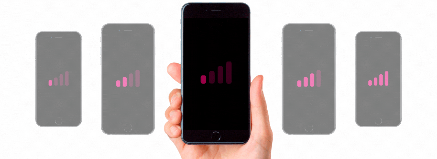
The solution in question needed to function in a fashion similar to existing hot desking platforms, with some COVID-19 era tweaks. Companies had the same amount of office space and employees, but now faced the limitations of 6-feet-apart and occupancy restrictions. We had to design an app that would allow employees to complete self health checks, reserve a desk within the office, and get notified of office hygiene.
Designed & Prototyped in Adobe XD —— Card sorting in Miro —— 1 month
Discover
We knew early on that the solution needed to be twofold: a building admin needed to be able to add and adjust floor plans, set maximum occupancy, and create QR codes for available seats. An office employee needed to be able to assess the office capacity and air quality each day and, subsequently, choose a desk to work at. To understand specific user needs, we conducted 8 user interviews. Our interview questions aimed to hone in on the specific measures (in addition to those provided by the CDC) that would make employees feel comfortable to return to work.
Interviews
My team and I wrote everything we learned from user interviews on sticky notes to create an affinity map. This allowed us to identify trends in user responses:
Among the users interviews, the average age was 34 years old
5/8 users expressed a desire to return back to office, 2/8 wanted to continue working remotely, and 1/8 was uncertain
7/8 mentioned wanting some sort of system that would keep track of who came into the office on any given day and to know if someone came in while symptomatic
8/8 did not want a strict return to work mandate, all 8 mentioned they wanted a return that was “flexible” and “safe”
Amid constantly changing guidelines, our work was cut out for us.
“Working from home is a huge challenge. I’m eating, sleeping, and working in the same 150sqft room, every day. I can’t wait to go back to the office, if not only to break up the monotony but I’m concerned that it may not be possible to do this safely at this time.”
Research
Our research led us to an array digital platforms as well as hardware that had already been designed to solve a few of the challenges we were facing. We took a deep dive into the world of desk booking, occupancy sensing, air quality reporting, office administrative duties, Covid-19 protocols, and general workplace safety.
Define
At this point we knew that the solution would have to be two-pronged: We would need to design one for the office employee returning to work and a separate, but related, product for the office administrator.
The “end user“ experience
Check office status before coming into work
Choose an office location, floor, and desk to work from
Submit a health check for Covid-19 symptoms
Ability to check in once in the office
Option to communicate with admin and send reports / sanitary updates
The “Admin“ experience
Have access to a dashboard with a notification center, current occupancy, and scheduled seating
Have access to a control panel to edit individual floors, mass edit all floors, occupancy and air quality range settings, etc.
Ability to send messages and alerts to the end users
Ability to add floor plans and mark certain spaces as meeting rooms, cubicles, a bathrooms
Develop
Based on the initial criteria discussed, we created some early artifacts to use as jumping off points for further ideation (shown below):

Above is one of the initial “End User“ workflows we came up with for the check-in process: 1) Prior to heading into the office, user logs into her mobile app to view available seats and to reserve a spot for the day; 2) She checks in at her location, selects the building and floor from two dropdown fields; 3) She sees the floor plan and selects her options—seats that are marked red are either occupied or unavailable, green seats are available; 4) She sees seat selection confirmation as well as details regarding what to do with her QR code; 5) Anne’s mobile app recognizes when she reaches her designated floor. She finds her seat and scans the in-app QR code by touching her phone against the panel scanner by her seat; 6) Anne connects to WiFi, and is provided with helpful guidelines regarding her changed work environment. She is now ready to settle in and start working.

Above is the the information architecture we came up for the admin application. This was the result of ideation sessions with the client and 6 rounds of open card sorting conducted with a pool of remote workers in various tech-related professions. We found that our 5 main navigation points would be Home (a dashboard view of some sort), Calendar, Scanner, Floor Plans, and Settings. Please note that this is the initial iteration of the information architecture and is subject to change throughout the UX Design process.

Above is the low-fi wireframe of the admin dashboard.
After several brainstorming sessions and user/client feedback in ideation sessions, we realized the following:
Technical considerations: the end user would need a mobile app that they can access from personal devices with location services enabled; the admin version would be installed on company tablets.
Users should be able to check work location info before heading into the office. This would allow for them to make an informed decision regarding whether it is safe to come in and whether they should even spend time commuting to the office based on various measures, including reserved capacity and air quality.
Most people will only be working from one office in their area and it should present as their default work location, saving time each morning searching for the right one. They should also have the capability to save their favorite floors and seats. It may also be useful to see who reserved various seats so that they can choose a spot close to their team.
Most “end users” will be utilizing this application first thing in the morning, as such there are a few things we can do to make the process even more pleasant, e.g., displaying the weather.
Our client requires that users check in to confirm that they are at the correct desk (we’re considering an in-app QR code that is read by a scanner at each corresponding desk). They also need users to check-out when they are done for the day; this will allow cleaning to crews to get started sanitizing each space at the end of the day.
Much like the admin application has a dashboard feature, the “end user” could user something similar once they’re in office. This would be a place to keep QR codes to access once they’re in the office, contact admin, reserve meeting rooms, check out at the end of the day, access important alerts etc. (Sketch shown below)
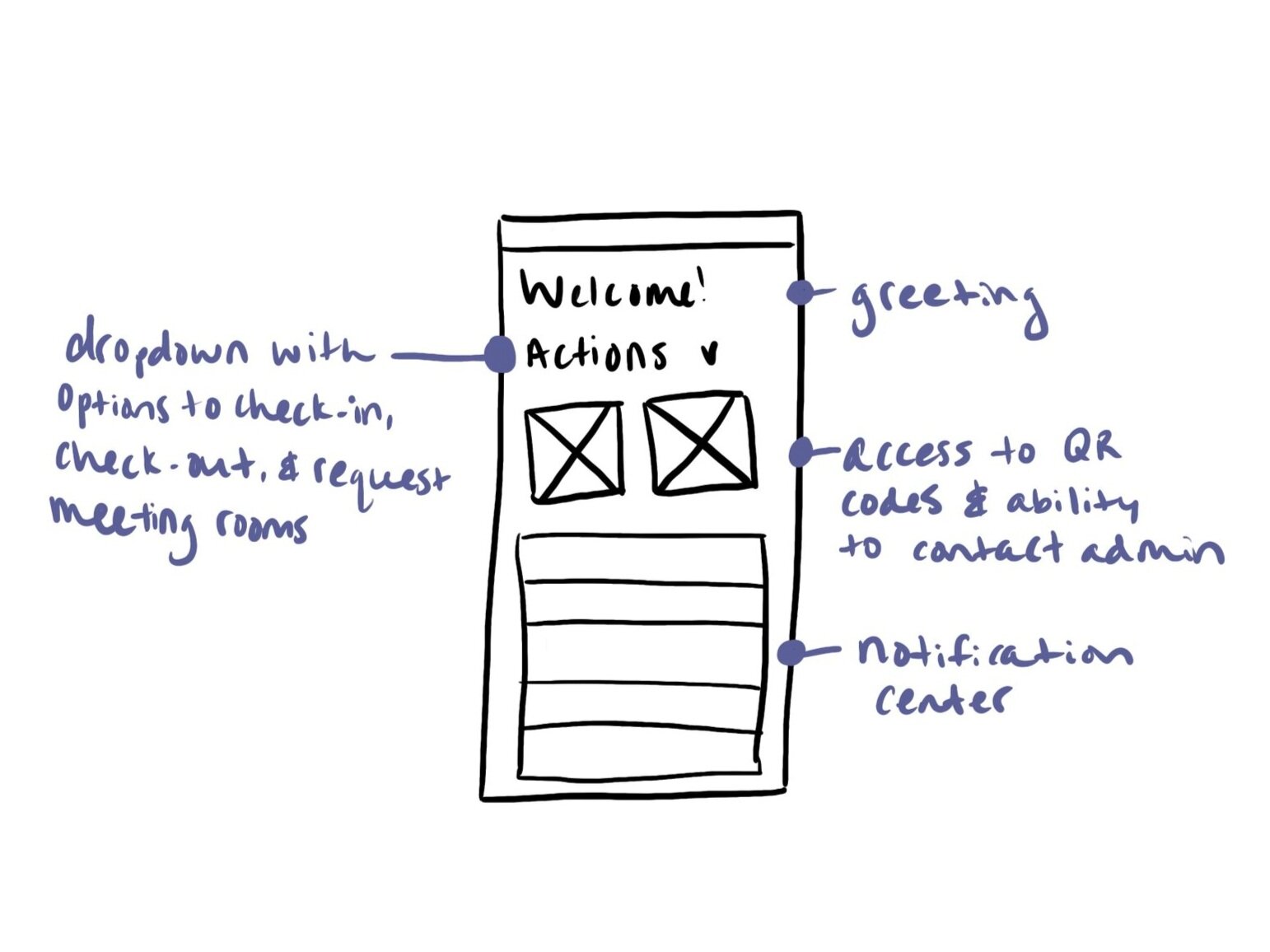
Low-Fi “End User” Dashboard
Ensures ability to check-in and -out of office, reserve meeting rooms, access QR codes, contact admin, and see important office updates.
Deliver
Our deliverables included (some can be found below):
A research report including existing market research, user interviews, usability tests, and user interaction insights
A style guide
High-fidelity prototypes of both parts of the application

Displayed above are a few sections of our style guide. Colors, buttons, and some controls can be found here.
Hi-Fi Prototype of the the End User Flow; Narrator: Ariella Mamlin
Hi-Fi Prototype of the the Admin flow; Narrator: Jennifer Pinai
Next steps
Because of the short time span of this project, there were several limitations in what we could and could not fit into the MVP product. As such, we presented the following next steps to our client:
A connected app for office cleaning crews. Cleaning crews have more work on their plates than ever before. In order to help organize and mobilize sanitation efforts, giving individuals access to an application that would allow them to see Air Quality Index, office alerts, notifications regarding sanitation issues, etc. could come in handy.
Calendar section of admin application did not make MVP one as we had anticipated. At the time of ideation, office events were still an unknown, not in any foreseeable future.
Automation for labeling spaces on floor plans. We recognize that labeling every type of space on every available floor can be a tedious task on the part of the office admin. Unfortunately, we faced a technical limitation when it came to automating this process for MVP.